Chart Examples
The following charts are generated directly from the Excel workbook and updated whenever the portfolio data is refreshed. They provide both individual stock views and portfolio-level performance tracking against the Portfolio Aim.
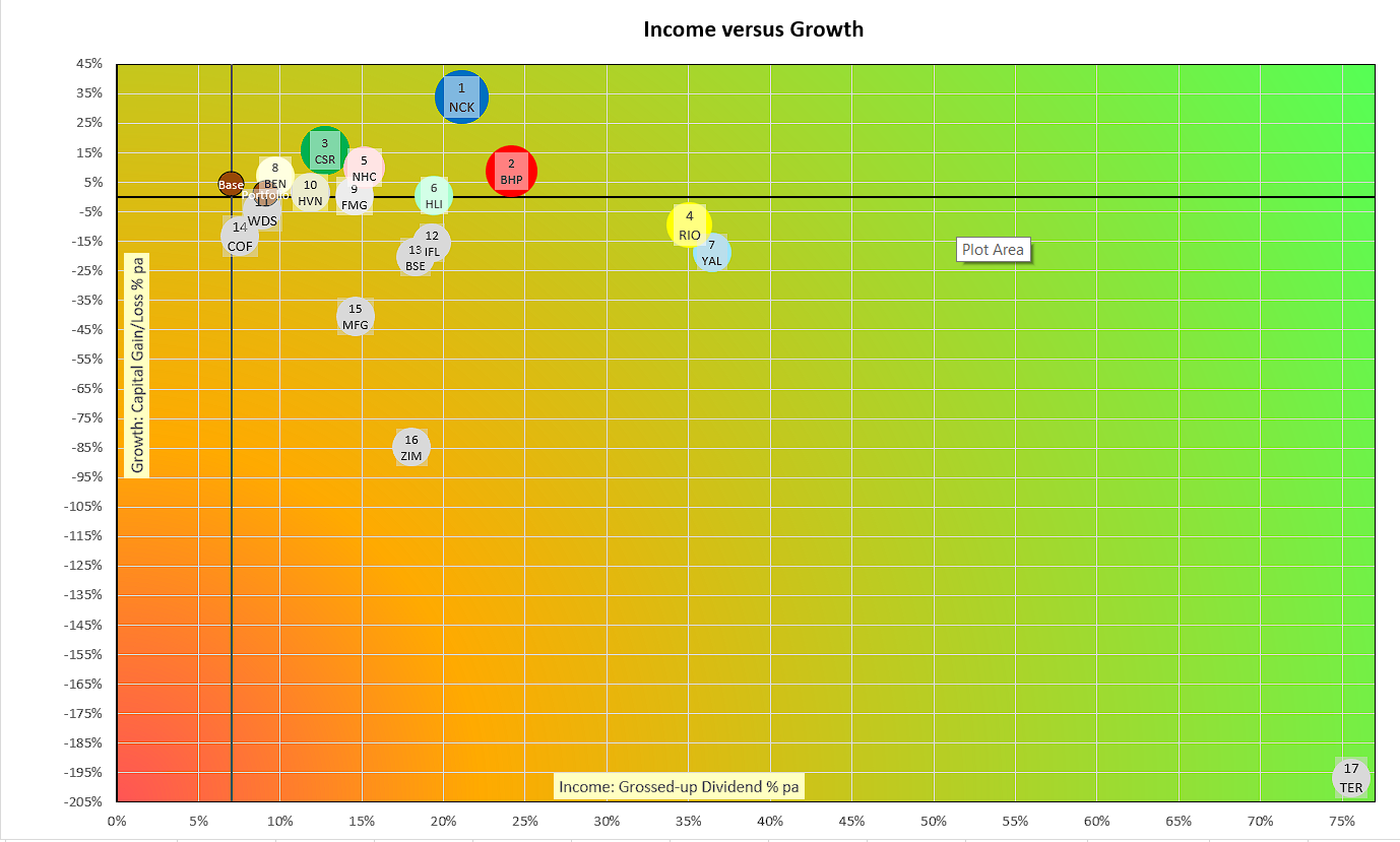
Income vs capital growth — individual stocks
Each stock is plotted on two axes: Annualised Grossed-up dividend income return (horizontal) versus Annualised Capital gain or loss (vertical). Stocks in the top-right quadrant (stars) are performing well on both dimensions of the Portfolio Aim — above-target income and above-target growth. Stocks in the bottom-left are candidates for the sell watch list (dogs).
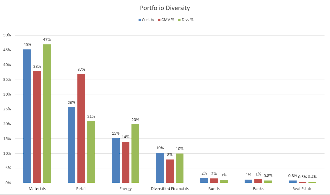
Portfolio diversity by sector
A diversified portfolio reduces the risk that a single sector downturn eliminates your income stream. This chart shows how the portfolio’s cost base is allocated across sectors. Note that a LIC (Listed Investment Company) such as WAM Capital contributes diversification across many underlying industries within a single line item.
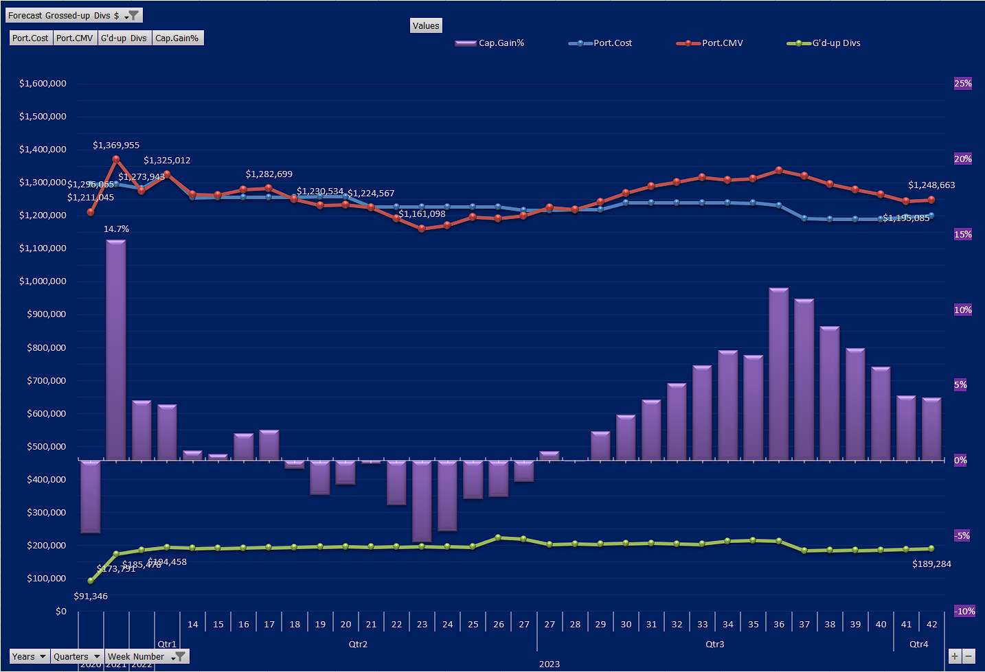
Weekly portfolio performance
This chart tracks total portfolio value over time, broken down by year, quarter and week. It tracks data values specific to our own Portfolio (that could not be found elsewhere online).
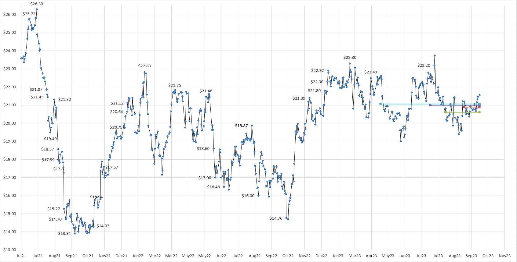
Historical share price with moving averages
For individual stocks, this chart replicates the standard price chart available on any broker platform, with the addition of four moving average overlays: 4-week, 2-month, 3-month and 6-month. The convergence or divergence of these averages can provide useful context when timing a buy or sell order — particularly when a stock is near a support or resistance level.